UI/UX-Prototype
The
project
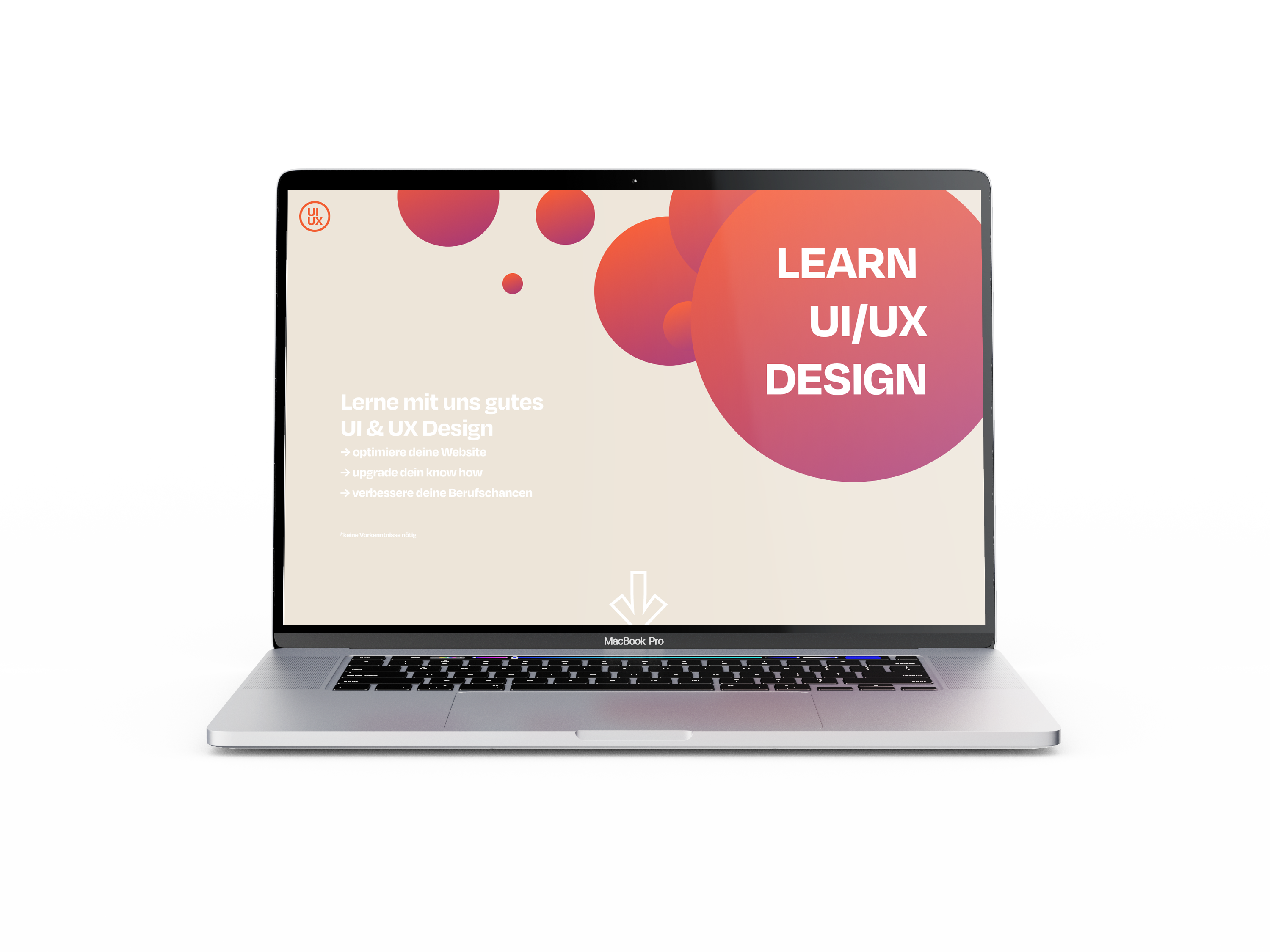
In a team of three we implemented the prototype of a website which teaches the basics of good UI- and UX-design.
The focus of the application was on a visually appealing appearance, intuitive usability and well-structured content.
First
steps
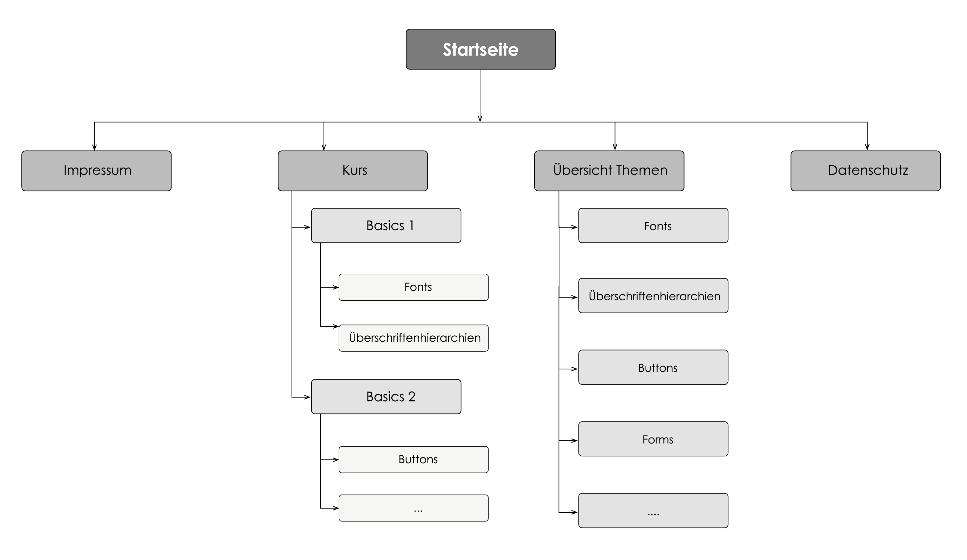
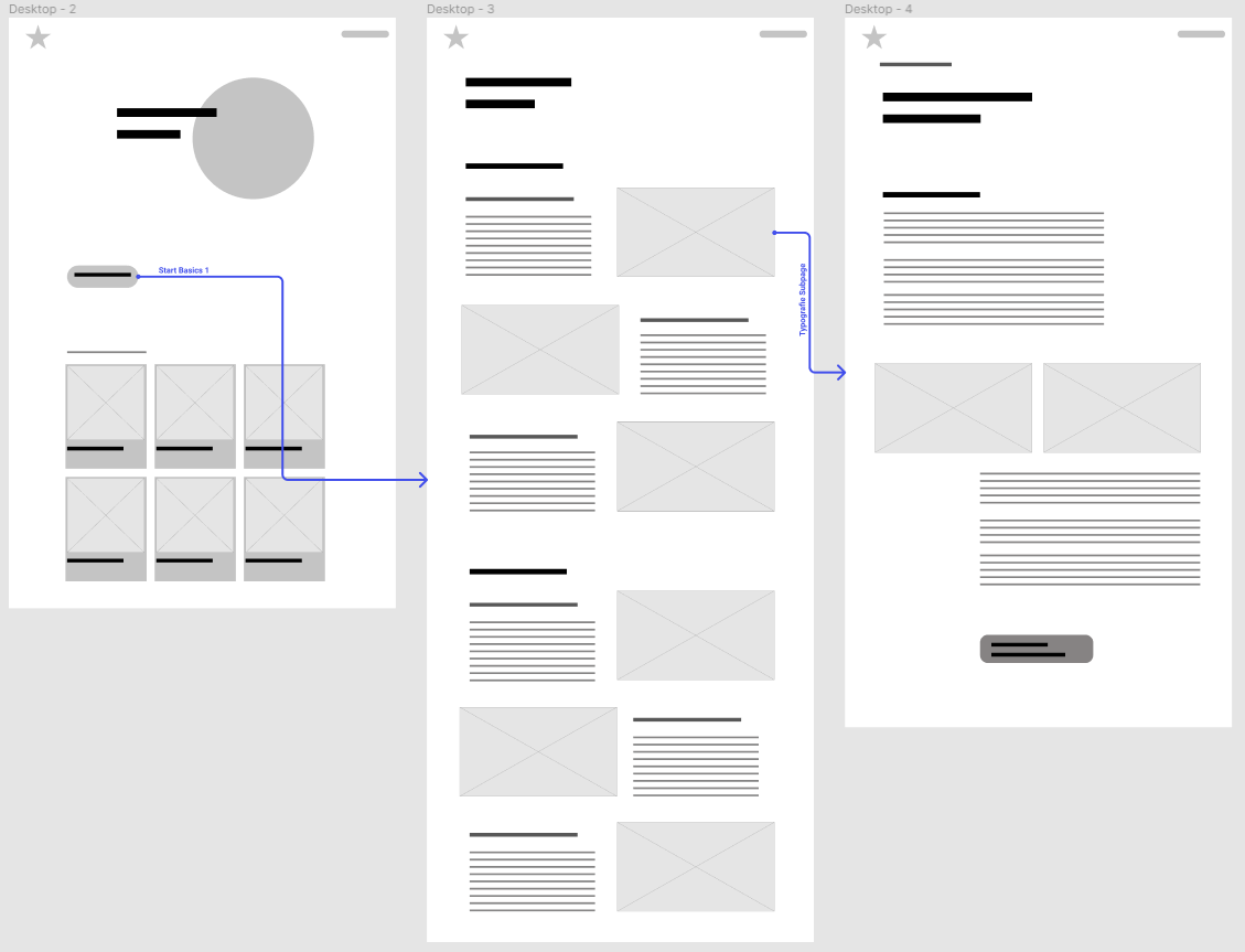
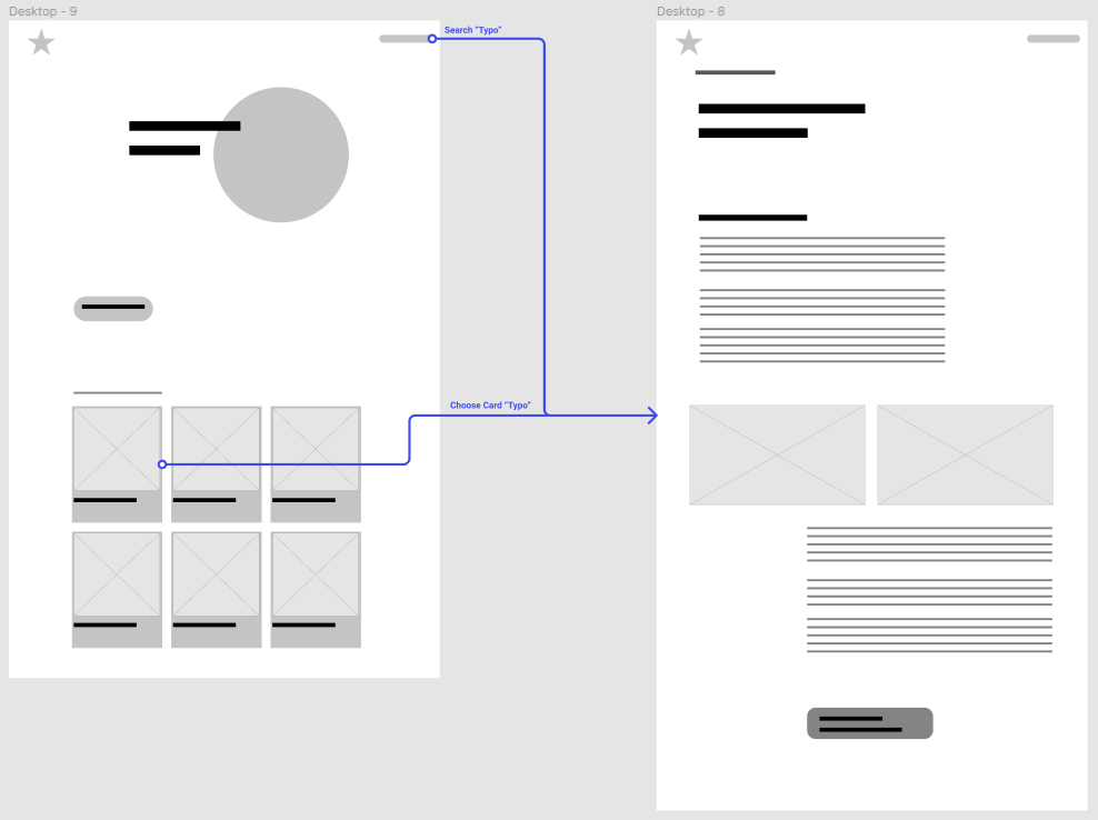
In the process we created personas, defined our target group, developed wireframes, sitemaps and user flows.
The wireframes and user flows shown here were the first rough drafts created in illustrator and figma.
Look
& Feel
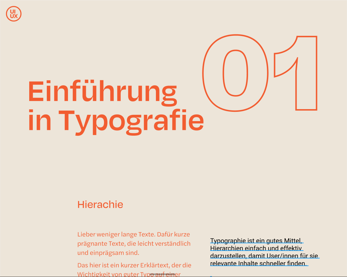
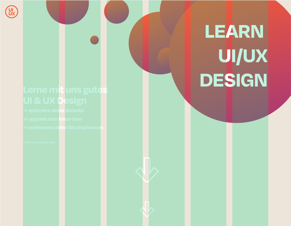
We opted for a modern look, and therefore chose to use two strong colours and a soft beige as counterpoint.
The fonts used both have a very unique and charismatic look and yet harmonise very well with each other.
The
result
The prototype was realised in figma as a web and mobile version. The final result offers users the opportunity to learn UI/UX-Design from scratch by participating in the course.
The course is divided into 3 levels. For users who already have basic knowledge or are only looking for a specific topic, we also offer the topics individually.