The
project
In the study course "processing" I spent one semester working on programming within a graphic context. At the end of the semester, an interactive, multimedia application of a self-selected topic should be implemented.
My goal was to create a website with three different interactive data visualizations using data of the MotoGP World championship.
To see the actual website in action, have a look here.

Line
Chart
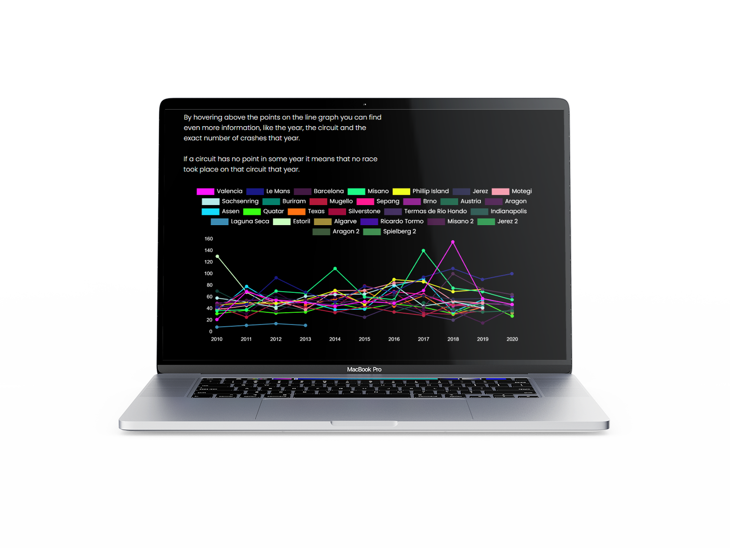
My first idea to display the crash data of the individual circuits in a readable yet exciting way was to create an interactive line chart.
For this, I made use of the JavaScript library chart.js, integrated a canvas in html and programmed the rest in a JavaScript-file.

Bubble
Chart
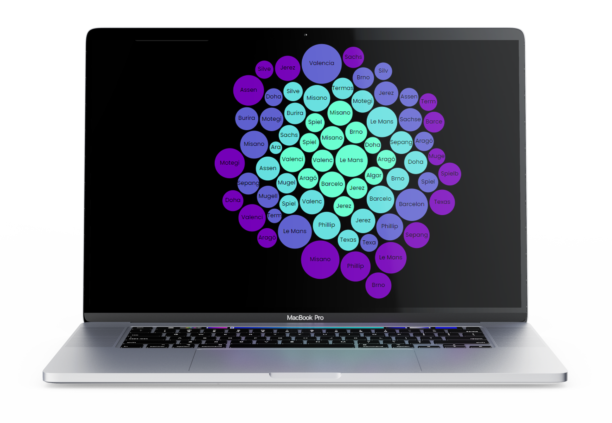
My second visualization was supposed to be a bit more fun but still offer just enough information. By hovering above or clicking on the bubbles a user gets more details such as an image of the circuit's layout or the exact number of crashes.
For this graph I used the JavaScript-Library d3.js, created an svg-element in html, stored my data in a JSON-file and coded the rest in a custom JavasScript-file.

Radar
Chart
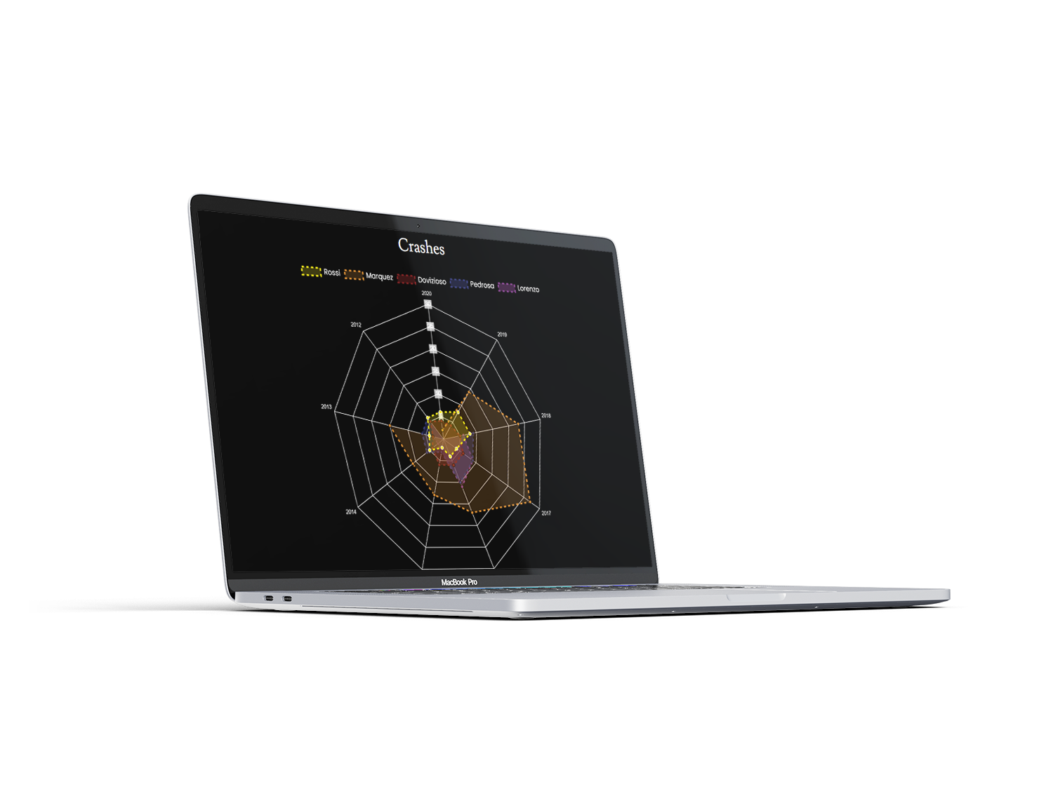
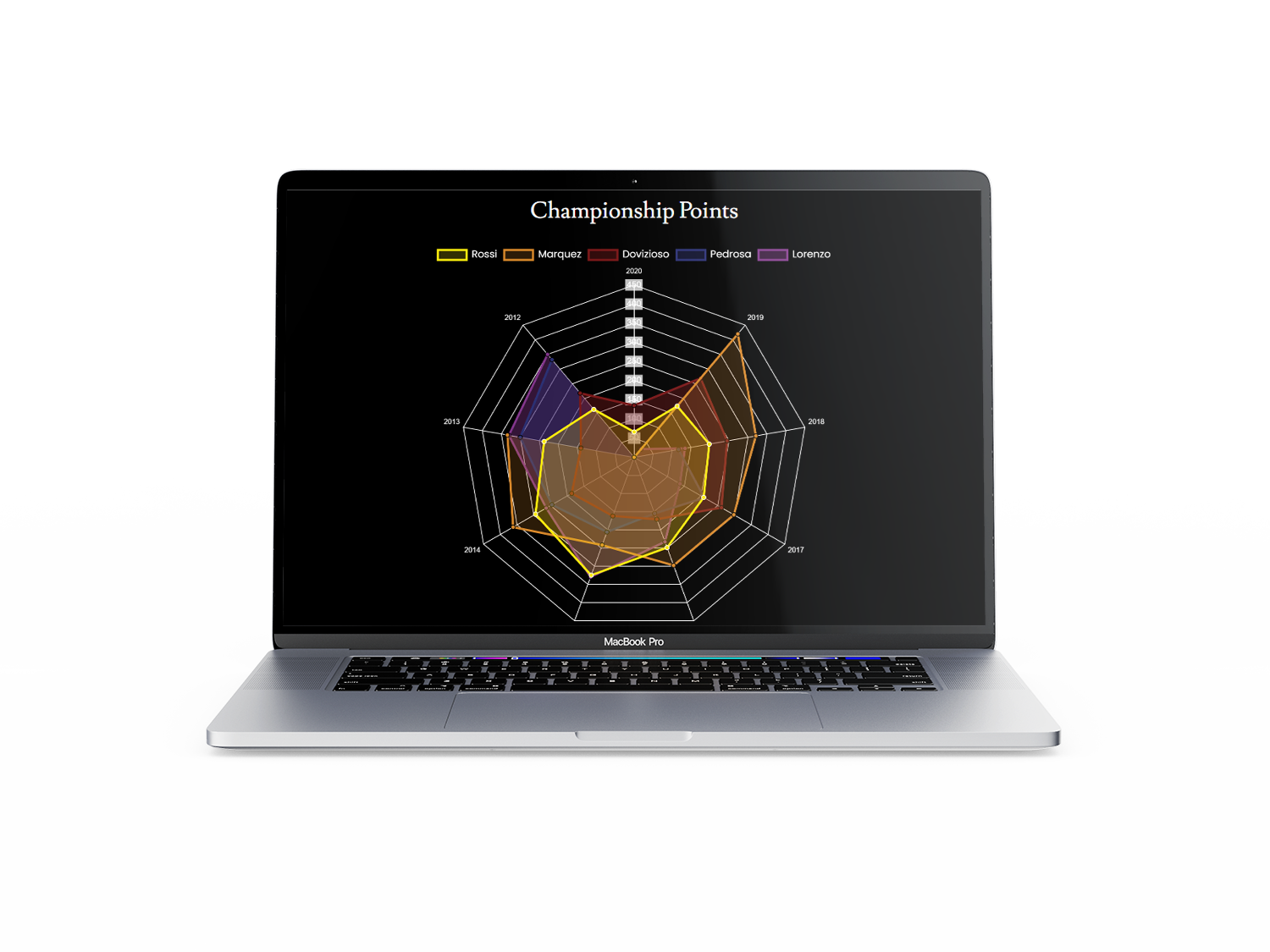
The last graph was supposed to allow a comparison of individual riders.
For this graph I again used chart.js and a custom JavaScript-file. In two indivial graphs one can now compare the championship points and crashes of these riders.
The
result
Instead of having only separate charts I decided to present them as a collective work on a website.
The corresponding website can be found here:
https://sarahhii.github.io/MotoGP_DataVis/.

