HMB Design Manual
The
project
As part of a semester project in the course "Corporate Design", I developed a new corporate design for the Historical Museum Bremerhaven.
In the CD manual all steps are documented: from logo development, to application examples, use of fonts, color concept, basic visual elements, and practical application examples.

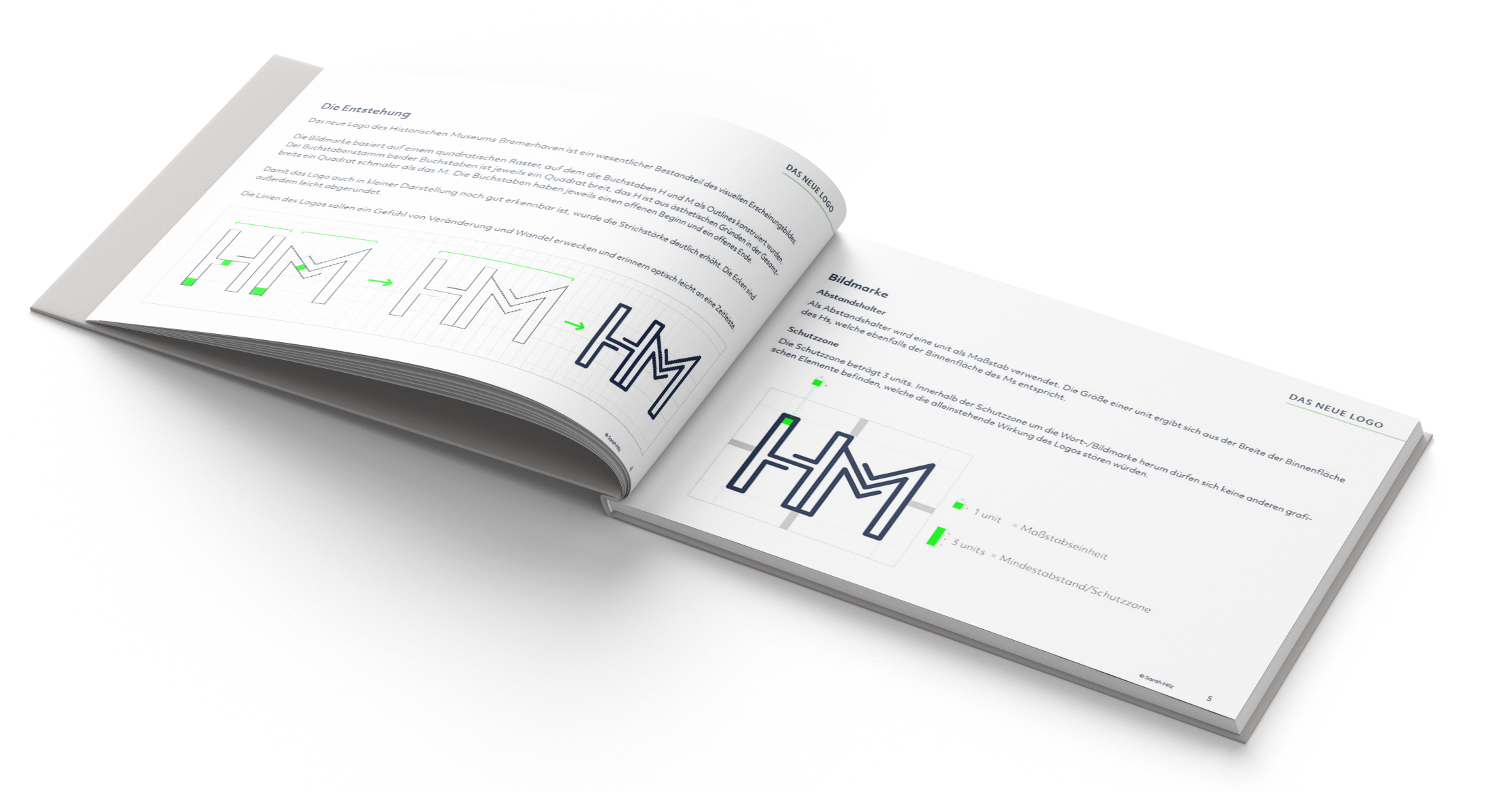
The new logo of the "Historisches Museum Bremerhaven" is an essential part of the visual identity. The figurative mark is based on a square grid on which the letters H and M have been constructed as outlines.

When designing the logo, I paid special attention to exact construction and ease of use. The letter stem of both letters is one square wide. The letters each have an open beginning and an open end. The lines of the logo are meant to evoke a sense of change and transformation.
Office
material
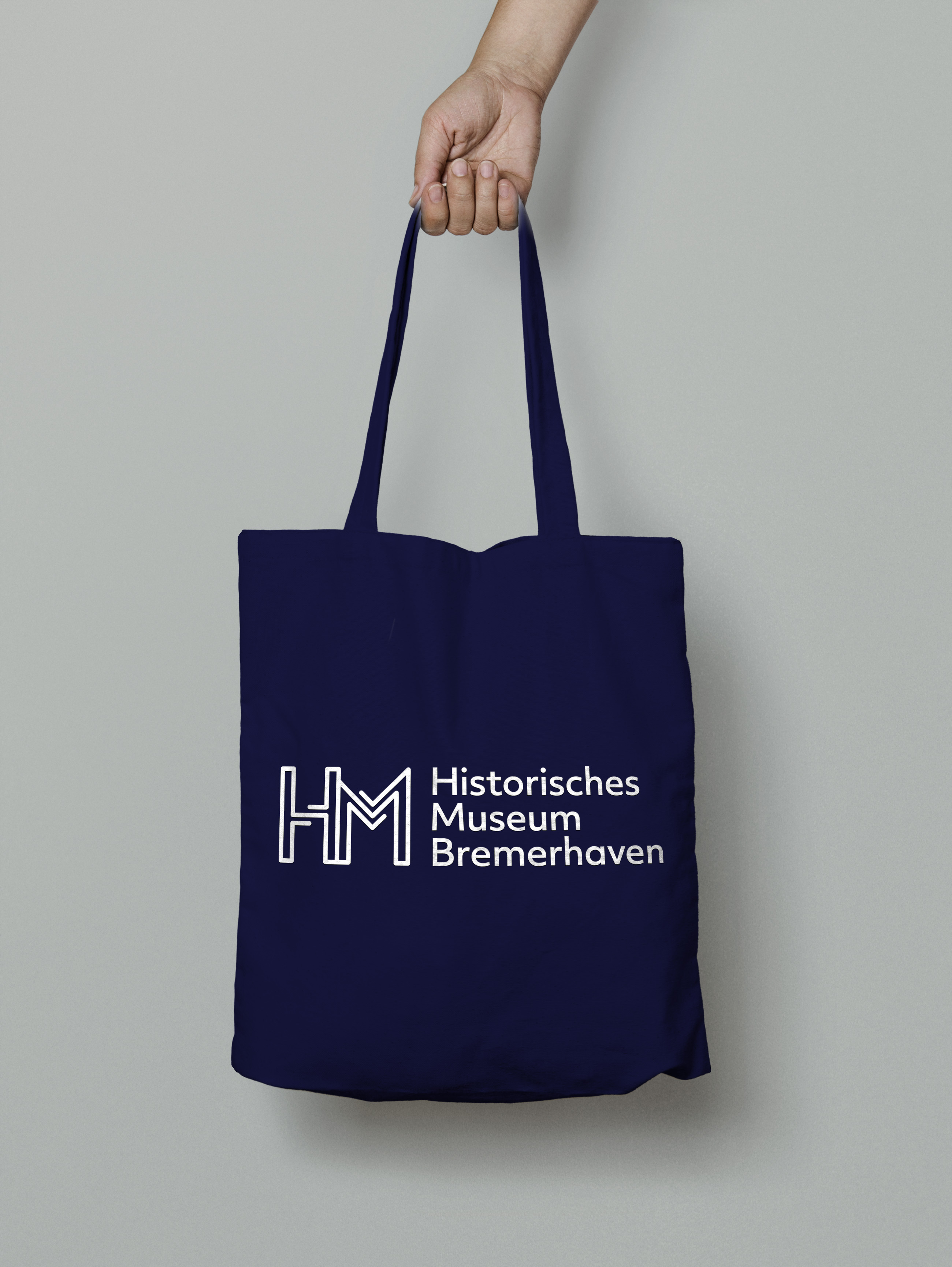
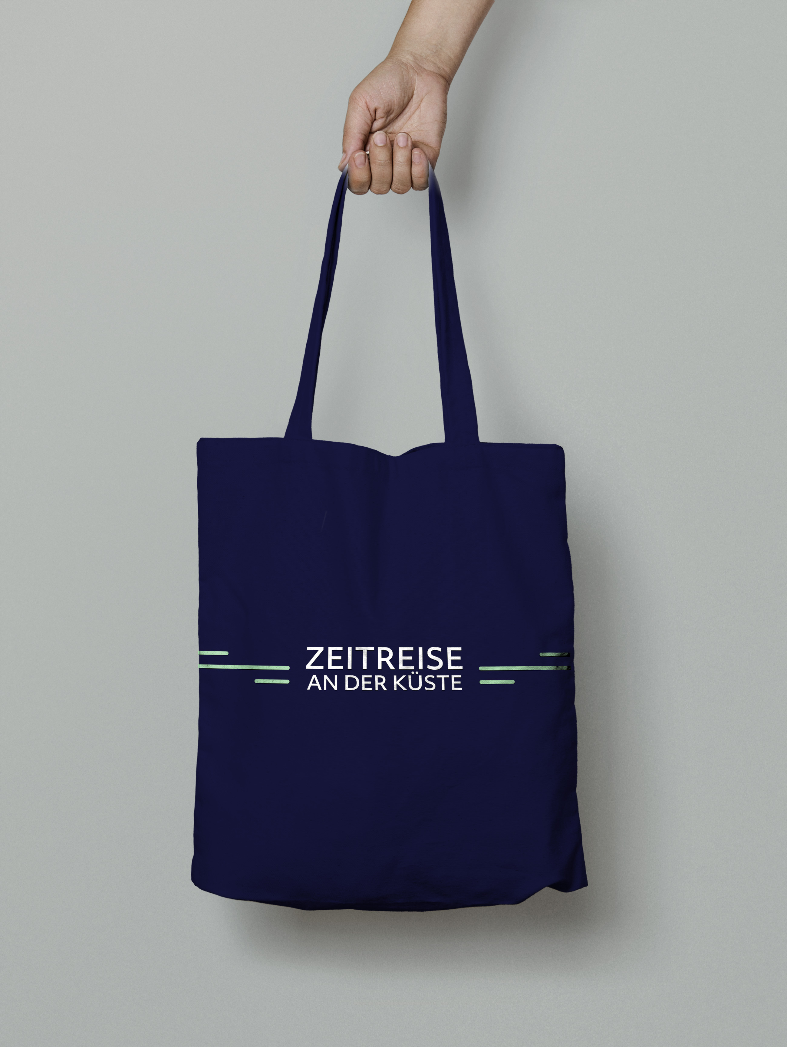
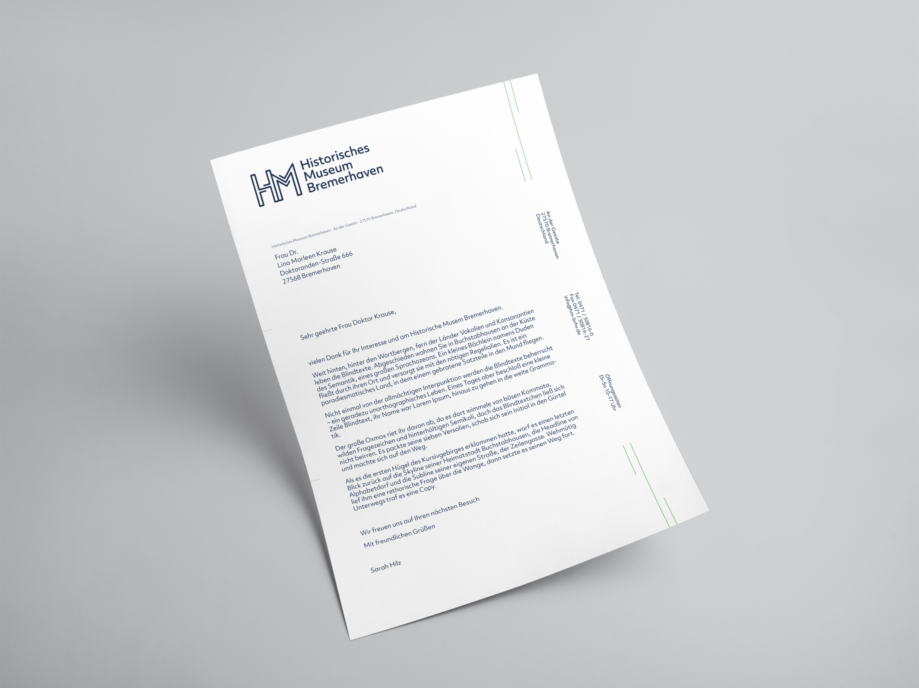
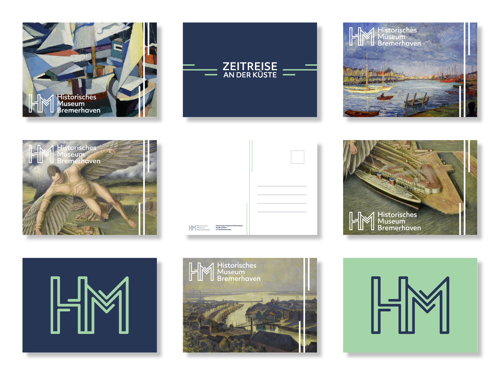
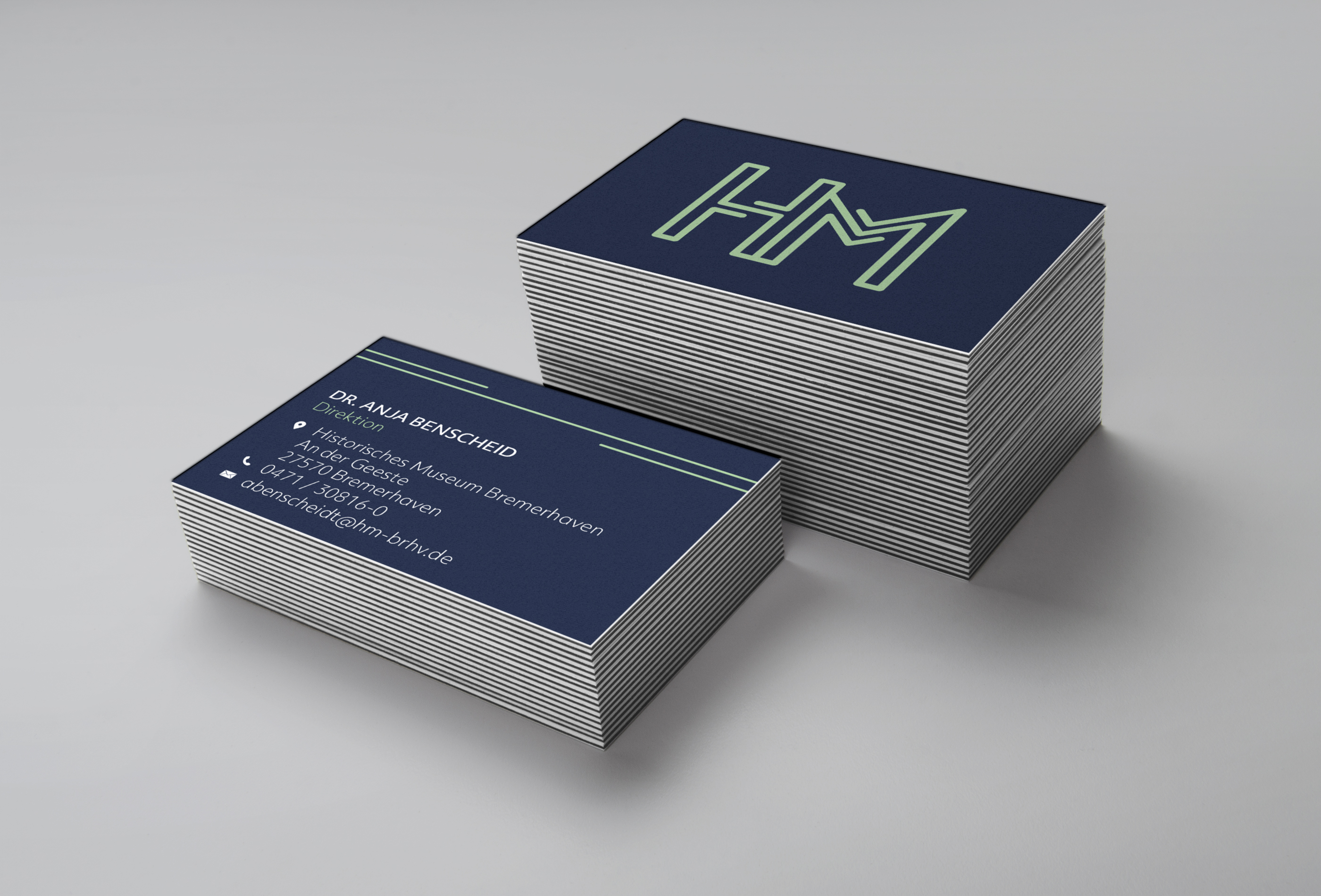
Next to logo development, use of fonts and color concept, I also designed official stationery, business cards, flyer, postcards and goodie bags.

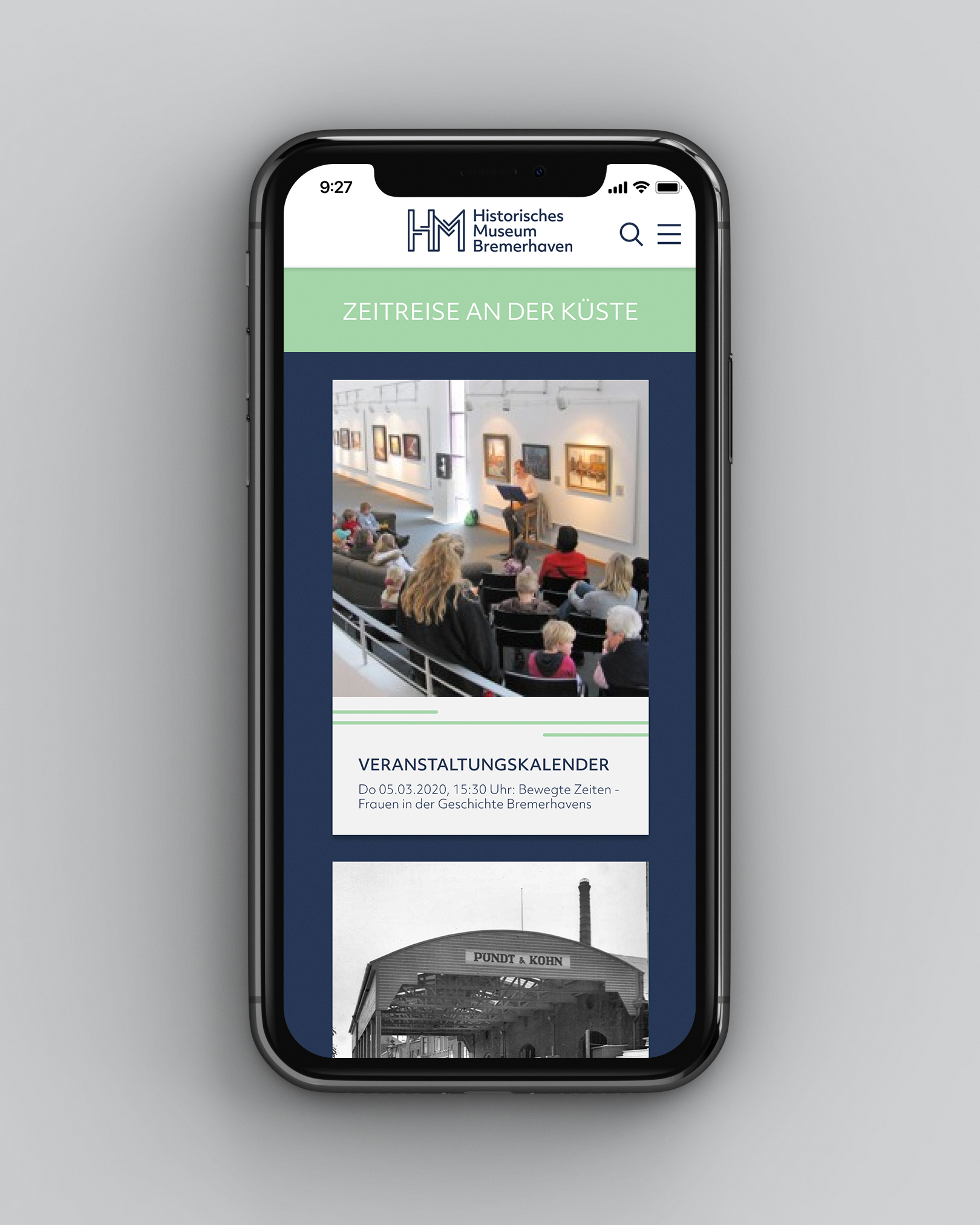
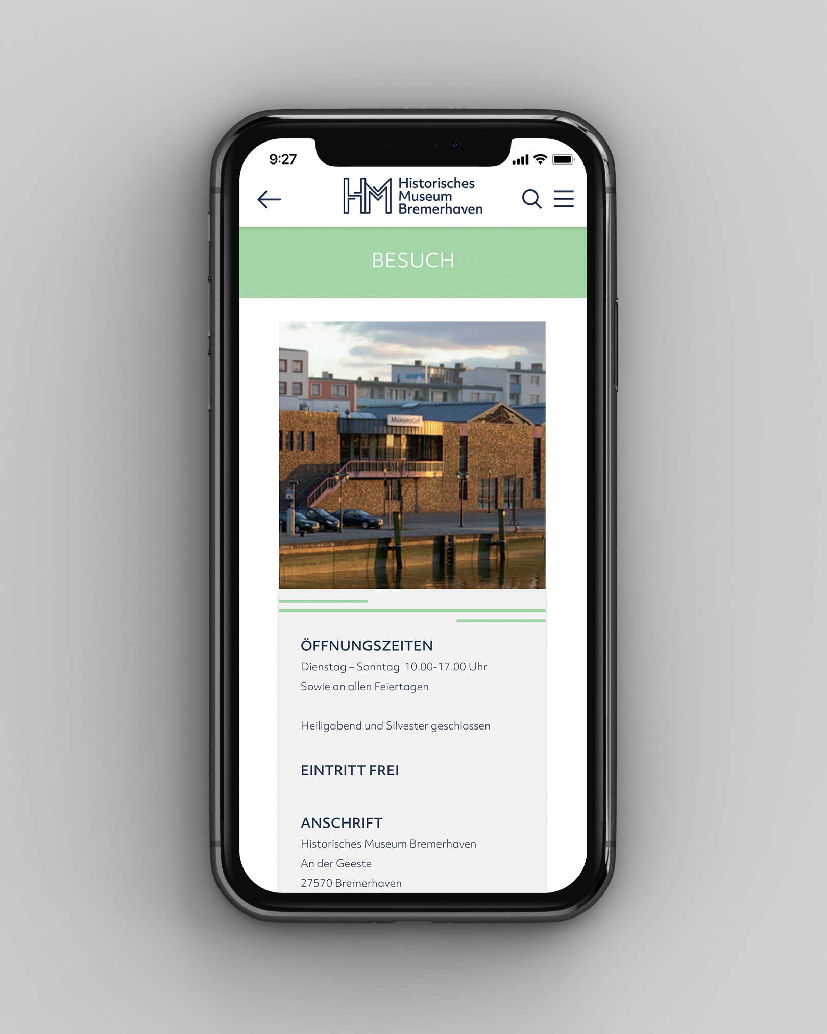
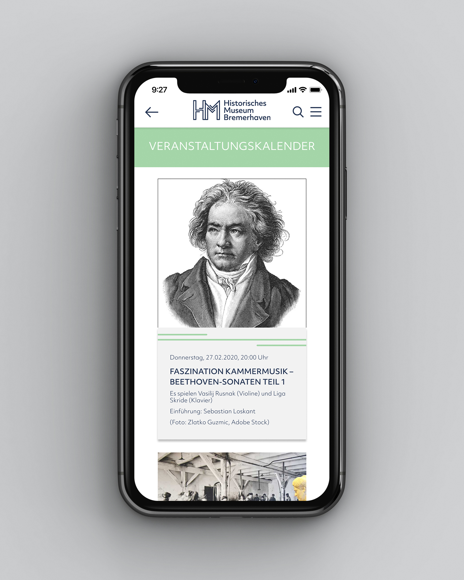
As the online presence is more and more important nowadays and a corporate design should work offline as well as online, I developed a prototype of the website in figma. For this I have implemented a desktop and a mobile application.
The
result
In the final design manual all topics such as picture mark and word mark, spacer and protective zone, Do's and Don'ts of logo and colors, grids, usage of fonts, visual elements and claim, as well as advertising material and the new online presence are covered.
